Industry:
Commodities
Key Services
Brand Transformation, Identity Design, Communication Design & Digital
BigMint: A Brand Transformation That Goes Beyond Steel & Coal
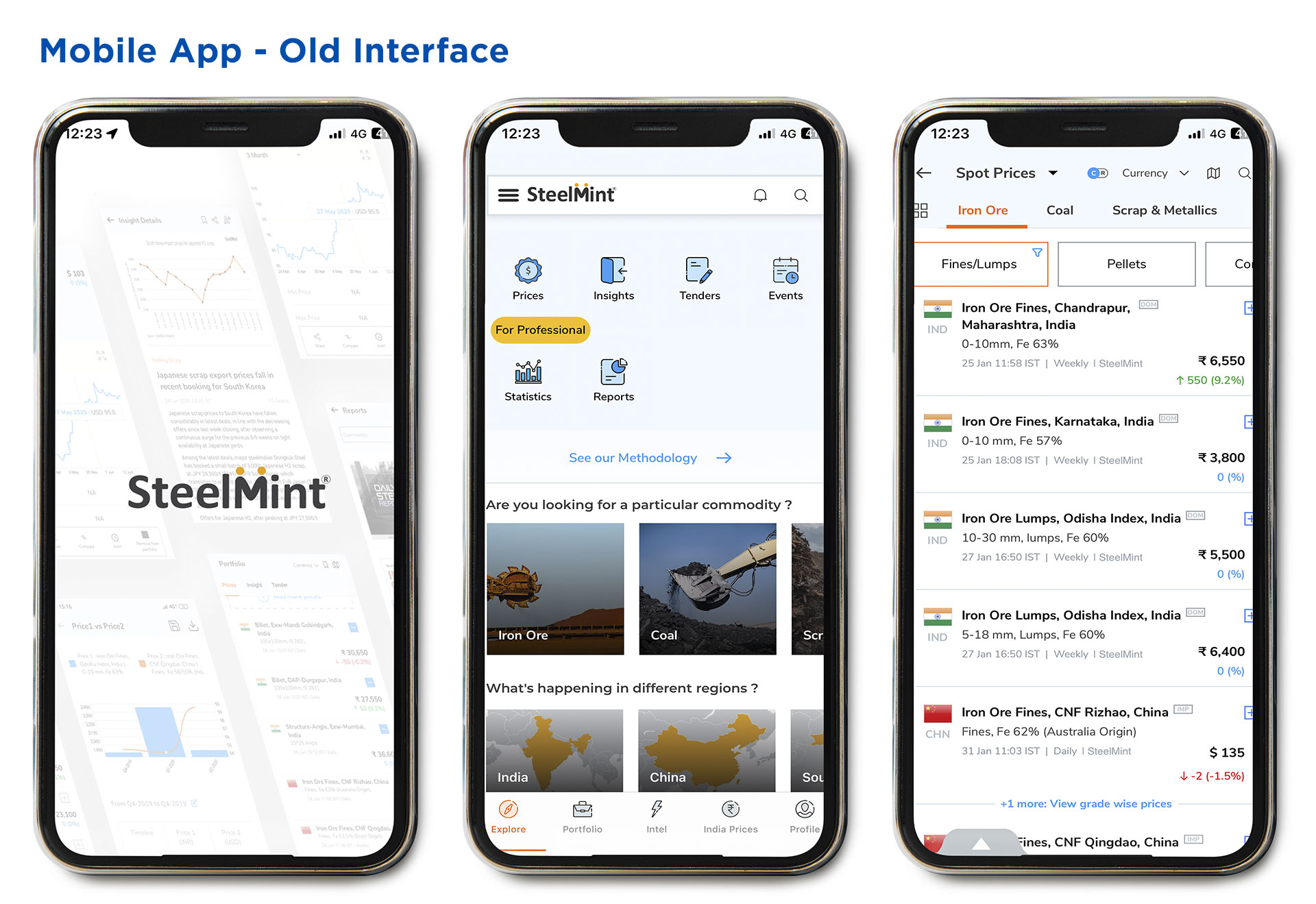
SteelMint, a market intelligence and price reporting firm, established itself as a trusted organisation for commodity pricing and analysis providing prices, indexes, data and insights. At the same time, its sister brand, CoalMint, positioned itself as a premier research and business intelligence company providing detailed data and holistic insights on the Indian and global coal and coke markets. Although both the brands were a part of BigMint Technologies Private Limited, they built their reputations in the commodities industry as separate entities.
Despite adding more commodities to its range and making inroads into global markets, the brand’s growth was being hampered by the lack of a unified identity. The company approached IndiDesign for a solution that would enable them to achieve sustainable growth without deviating too far from their established brands, SteelMint & CoalMint.


The Challenges of
Disjointed Identities
We identified the key challenges of disjointed identities for a brand.
Inconsistent Brand Image: Inconsistencies in brand image creates confusion and incoherent messaging, diluting the overall brand perception.
Lack of Clear Communication: Difficulty in crafting clear and consistent brand communication leads to a disconnect with the intended audience.
Hindered Growth: When looking to expand into new markets or introduce new commodities, disjointed identities impede growth.
Competitive Disadvantage: In a competitive market, a company with a disjointed identity loses its competitive advantage.
Addressing these challenges required a strategic approach to unify the company’s identity, align internal teams, and ensure consistent communication across all channels. Unifying all businesses under one brand gives the company the options of adding new business lines, verticals and geographies in the future, with the same investment.


The Way Forward:
Back to the Roots
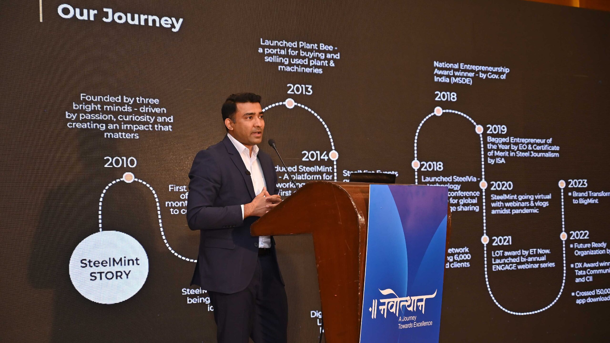
The company needed an identity that would not only convey its diverse portfolio of commodities but also identify with its legacy. SteelMint’s & CoalMint’s parent company was known as BigMint. So deciding to go back to its roots, we chose the name “BigMint” to signify growth and make way for future expansion.
“BigMint” is a versatile and inclusive identity that encompasses the company’s growth in all crucial aspects: vision, mission, purpose, people, and markets. It seamlessly integrates new business verticals, commodities and geographies to accurately represent its wide range of capabilities.
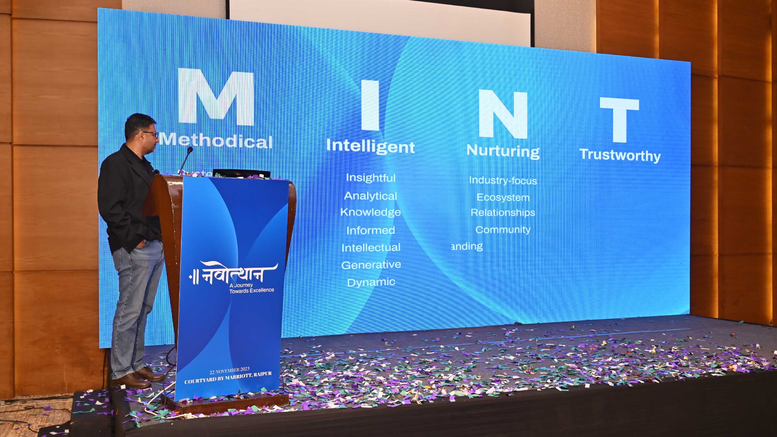
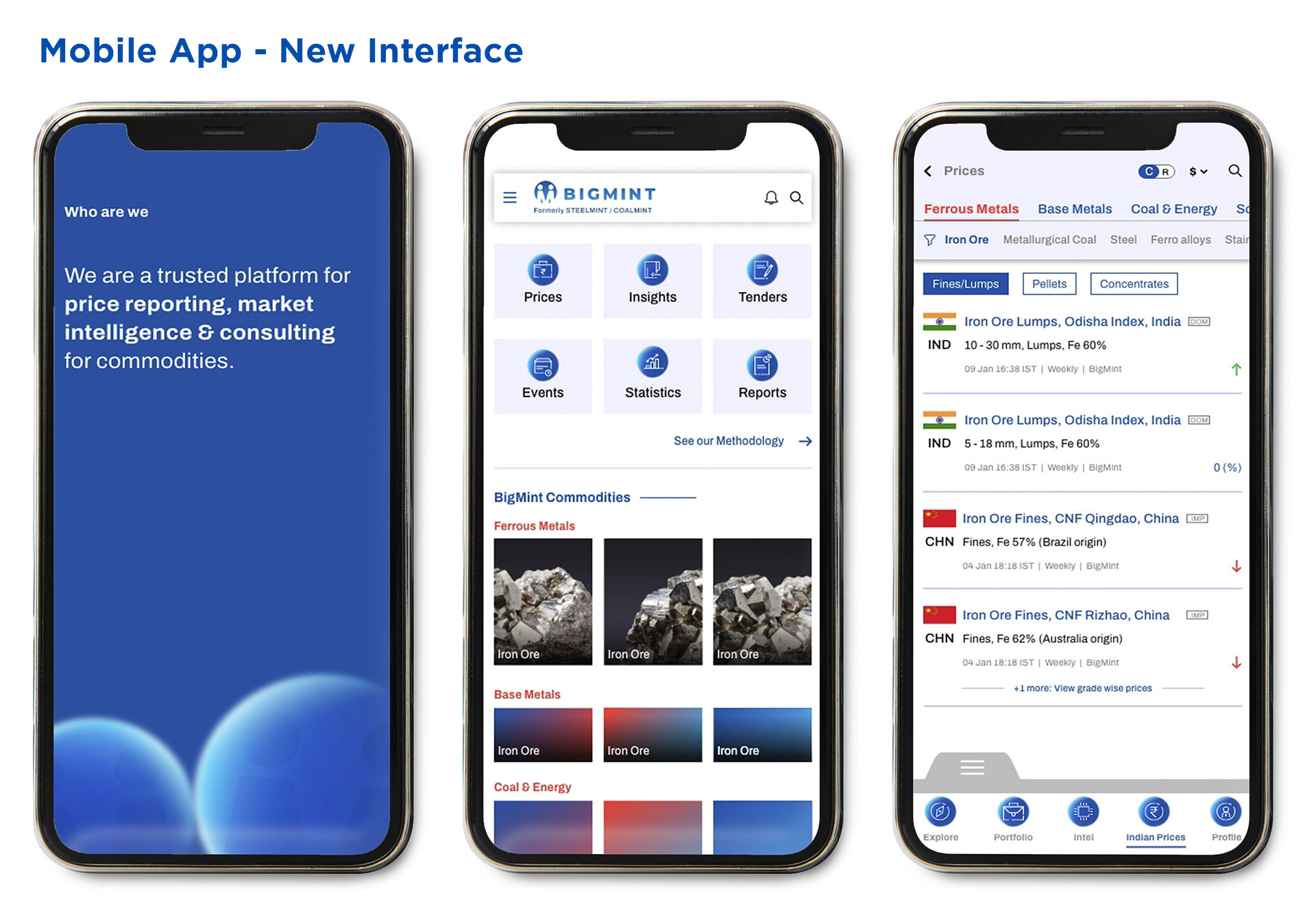
The company’s new MINT values articulate its essence clearly, enabling all stakeholders to identify and align with it more closely. The new symbol, a bold capital “M,” depicts two individuals meeting in a circle, embodying unity, collaboration and commitment to transparent & reliable price reporting.
The word mark features a clean, modern, and geometric sans-serif typeface that prioritises clarity, with balanced proportions that enhance readability with consistent spacing. Its smooth, well-defined lines enhance clarity and reduce visual distractions, making it suitable for a wide range of applications.
The brand’s visual language features two spheres sporting the brand symbol over BigMint Dawn gradient. It represents the multitude of data points that the company analyses to proffer its insights.
BigMint’s new identity unifies its business verticals under one brand that seamlessly encompasses its essence, values, and identity.


The Future is Big –
The Impact, Bigger
BigMint’s new identity is a significant differentiator. It is a representative of their new brand values and evolution from Price Reporting to providing Industry Insights and everything in between. Although it stays close to its roots, the new identity brings a distinctly global flavour with its new brand elements including the logo, colours and typeface.
“BigMint” is now poised to be a catalyst in the growth and development of industries across geographies and to create a strong community to foster progress and stability.
We crafted BigMint’s brand essence & positioning with a strategic design-led approach. If you want to partner us in your own transformational journey, reach out to us at info@indidesign.in
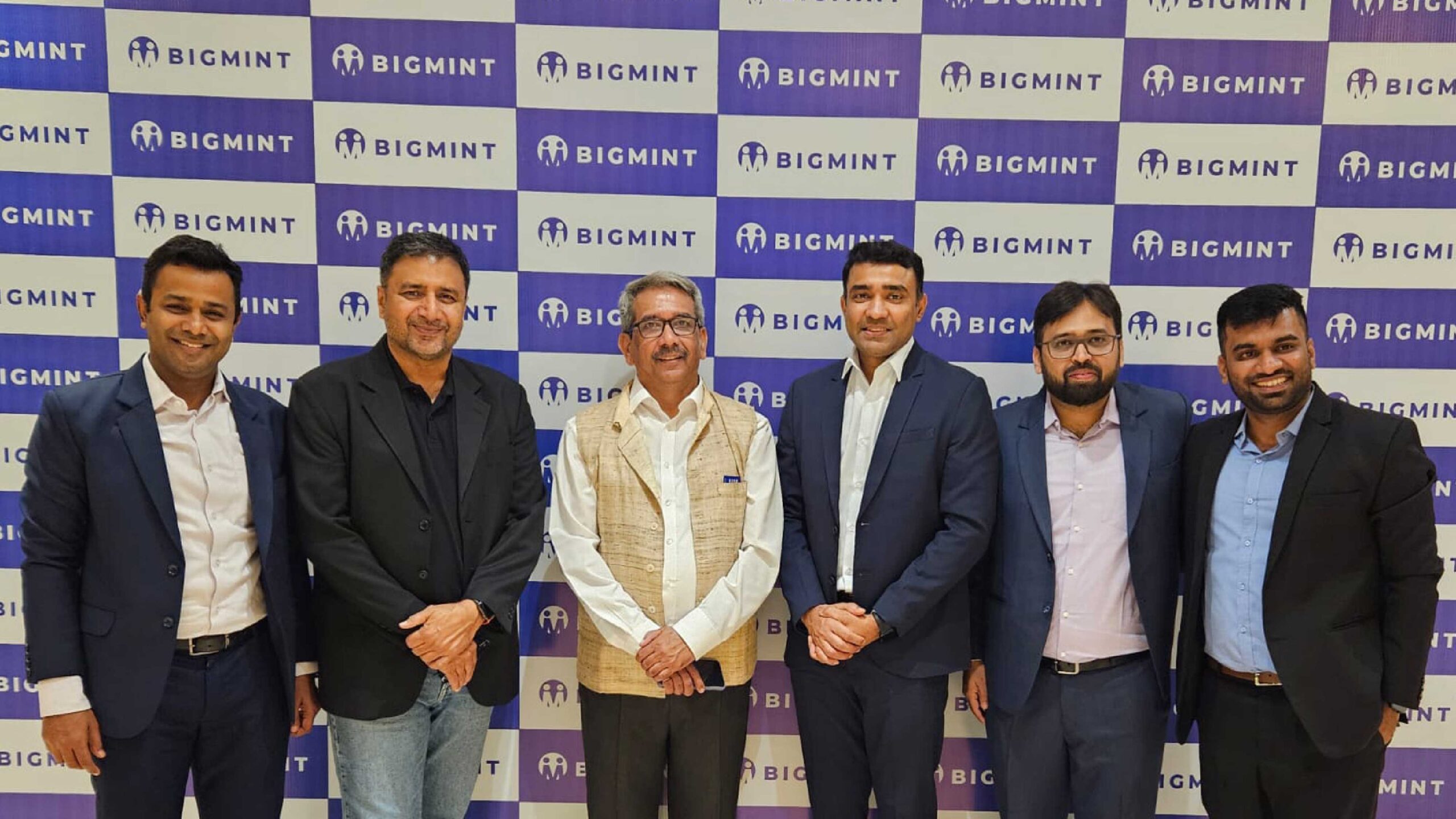
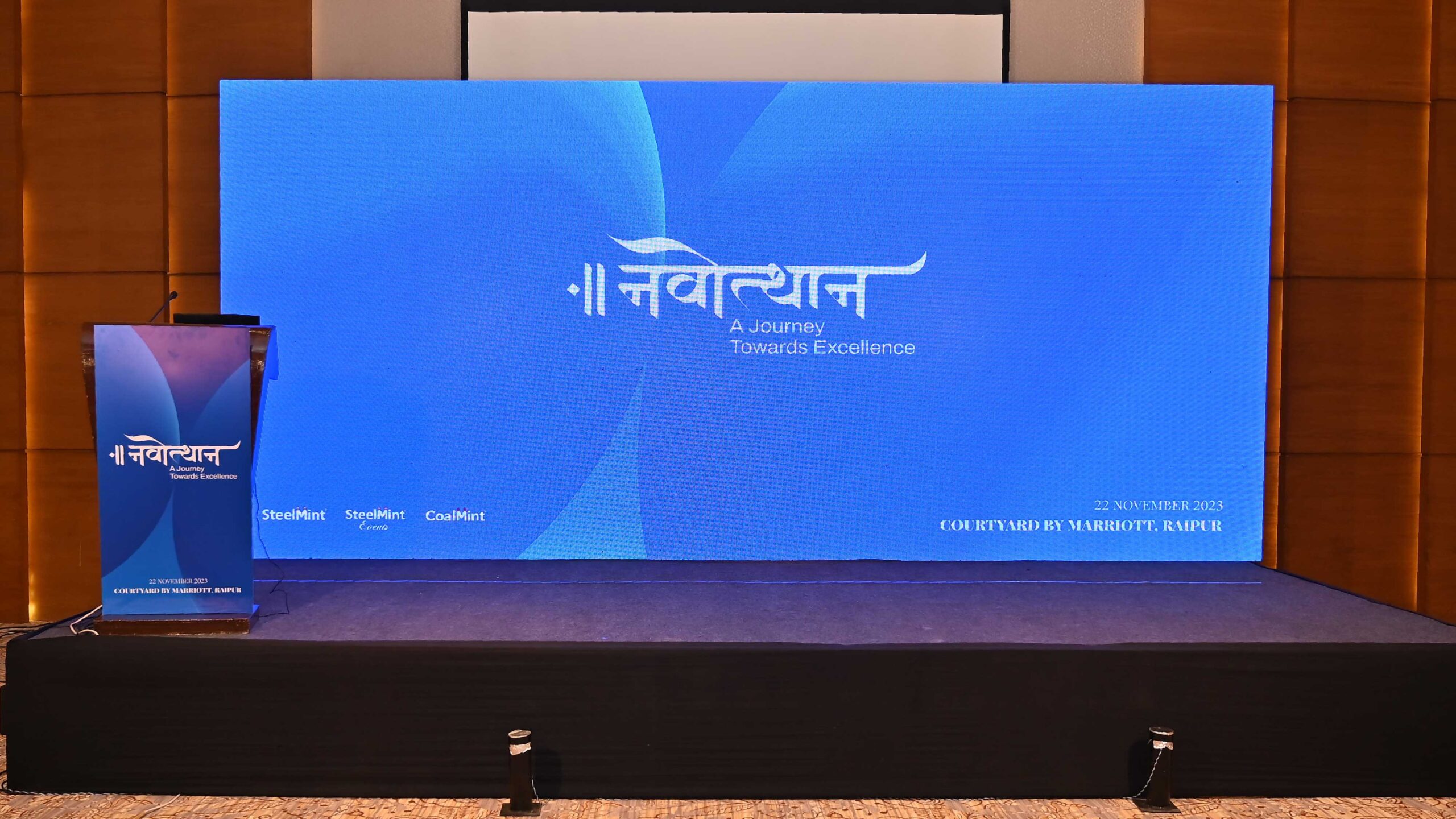
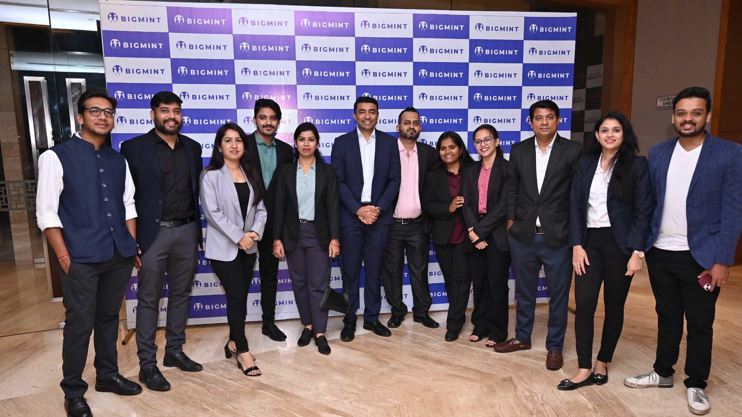
Sudhir Sharma, founder of IndiDesign, presented the BigMint brand, its ethos & values to the company’s employees at the internal launch event held on 22nd November 2023, at Raipur.


Industry:
Commodities
Key Services
Brand Transformation, Identity Design, Communication Design & Digital
BigMint: A Brand Transformation That Goes Beyond Steel & Coal
SteelMint, a market intelligence and price reporting firm, established itself as a trusted organisation for commodity pricing and analysis providing prices, indexes, data and insights. At the same time, its sister brand, CoalMint, positioned itself as a premier research and business intelligence company providing detailed data and holistic insights on the Indian and global coal and coke markets. Although both the brands were a part of BigMint Technologies Private Limited, they built their reputations in the commodities industry as separate entities.
Despite adding more commodities to its range and making inroads into global markets, the brand’s growth was being hampered by the lack of a unified identity. The company approached IndiDesign for a solution that would enable them to achieve sustainable growth without deviating too far from their established brands, SteelMint & CoalMint.
The Challenges of
Disjointed Identities
We identified the key challenges of disjointed identities for a brand.
Inconsistent Brand Image: Inconsistencies in brand image creates confusion and incoherent messaging, diluting the overall brand perception.
Lack of Clear Communication: Difficulty in crafting clear and consistent brand communication leads to a disconnect with the intended audience.
Hindered Growth: When looking to expand into new markets or introduce new commodities, disjointed identities impede growth.
Competitive Disadvantage: In a competitive market, a company with a disjointed identity loses its competitive advantage.
Addressing these challenges required a strategic approach to unify the company’s identity, align internal teams, and ensure consistent communication across all channels. Unifying all businesses under one brand gives the company the options of adding new business lines, verticals and geographies in the future, with the same investment.
The Way Forward:
Back to the Roots
The company needed an identity that would not only convey its diverse portfolio of commodities but also identify with its legacy. SteelMint’s & CoalMint’s parent company was known as BigMint. So deciding to go back to its roots, we chose the name “BigMint” to signify growth and make way for future expansion.
“BigMint” is a versatile and inclusive identity that encompasses the company’s growth in all crucial aspects: vision, mission, purpose, people, and markets. It seamlessly integrates new business verticals, commodities and geographies to accurately represent its wide range of capabilities.
The company’s new MINT values articulate its essence clearly, enabling all stakeholders to identify and align with it more closely. The new symbol, a bold capital “M,” depicts two individuals meeting in a circle, embodying unity, collaboration and commitment to transparent & reliable price reporting.
The word mark features a clean, modern, and geometric sans-serif typeface that prioritises clarity, with balanced proportions that enhance readability with consistent spacing. Its smooth, well-defined lines enhance clarity and reduce visual distractions, making it suitable for a wide range of applications.
The brand’s visual language features two spheres sporting the brand symbol over BigMint Dawn gradient. It represents the multitude of data points that the company analyses to proffer its insights.
BigMint’s new identity unifies its business verticals under one brand that seamlessly encompasses its essence, values, and identity.
The Future is Big –
The Impact, Bigger
BigMint’s new identity is a significant differentiator. It is a representative of their new brand values and evolution from Price Reporting to providing Industry Insights and everything in between. Although it stays close to its roots, the new identity brings a distinctly global flavour with its new brand elements including the logo, colours and typeface.
“BigMint” is now poised to be a catalyst in the growth and development of industries across geographies and to create a strong community to foster progress and stability.
We crafted BigMint’s brand essence & positioning with a strategic design-led approach. If you want to partner us in your own transformational journey, reach out to us at info@indidesign.in
Sudhir Sharma, founder of IndiDesign, presented the BigMint brand, its ethos & values to the company’s employees at the internal launch event held on 22nd November 2023, at Raipur.