International School of Belgium
Industry: Educational Institute
Brand Identity & Communication Design
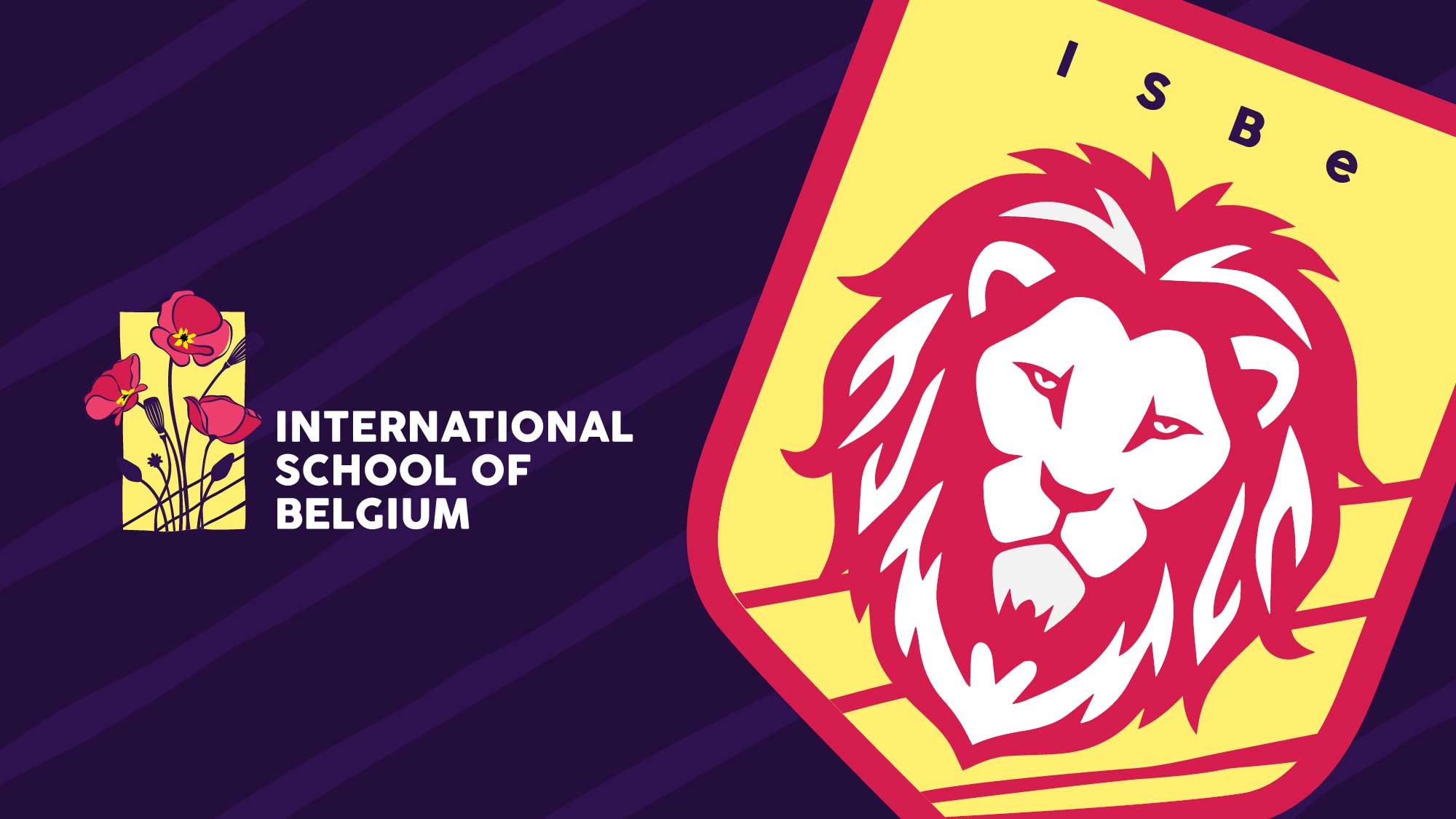
IndiDesign built the complete brand identity, including naming, branding, visual identity, and communication design for International School of Belgium, a modern tech-savvy school with 21st-century learning strategies located in Kontichsesteenweg, Belgium.
The school, which had previously gone by a different name, needed help connecting with local and international students. It required a new name and visual identity system to bridge the gap.
IndiDesign proposed a new name and updated visual identity centred around the school’s core values of creativity, curiosity, open-mindedness, and individual reflection. The rejuvenated identity helped the school to connect better with students.
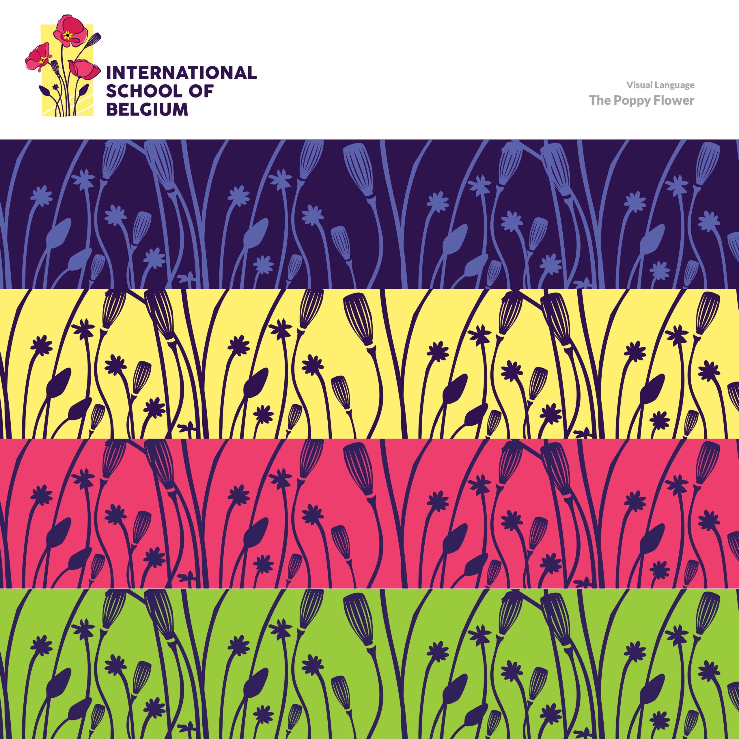
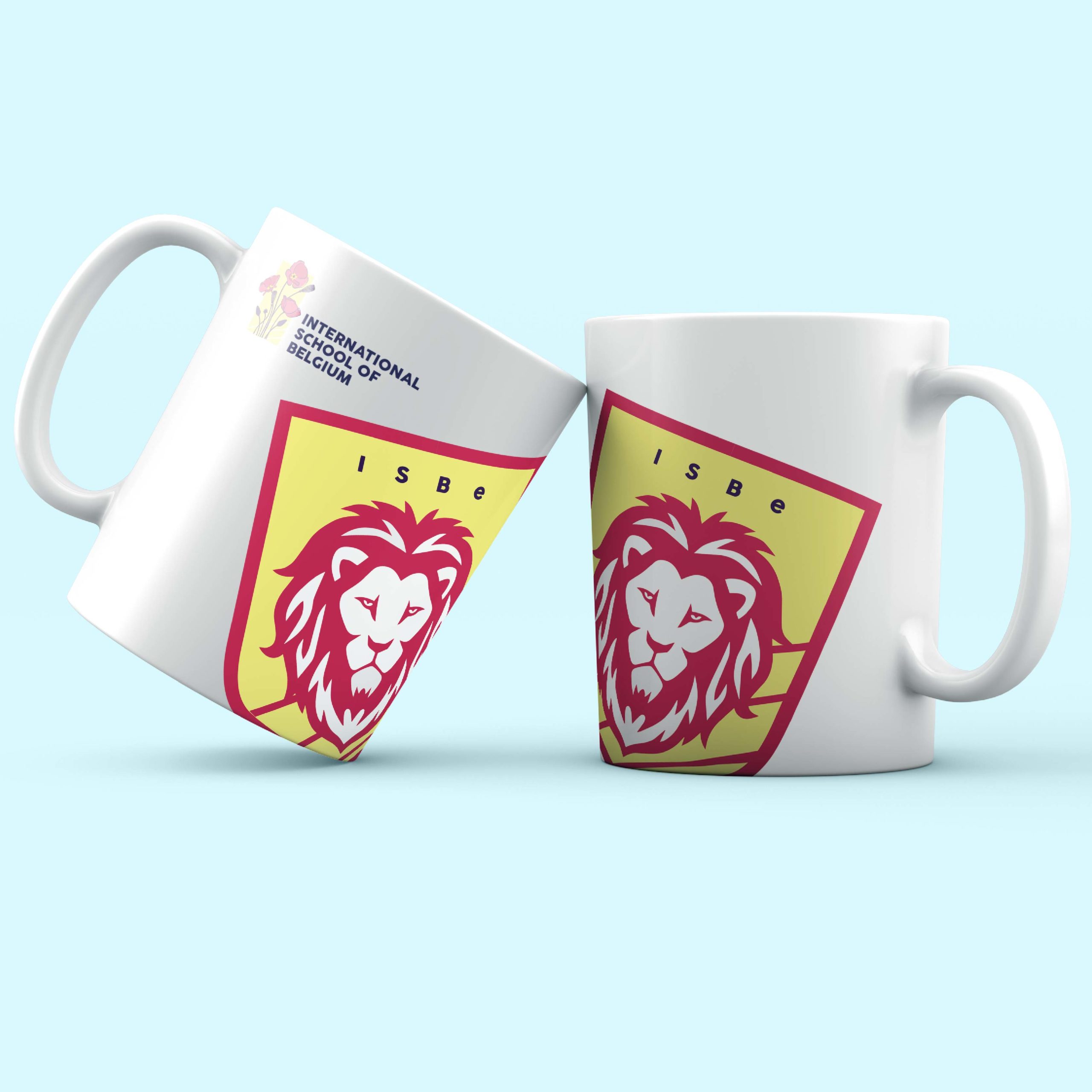
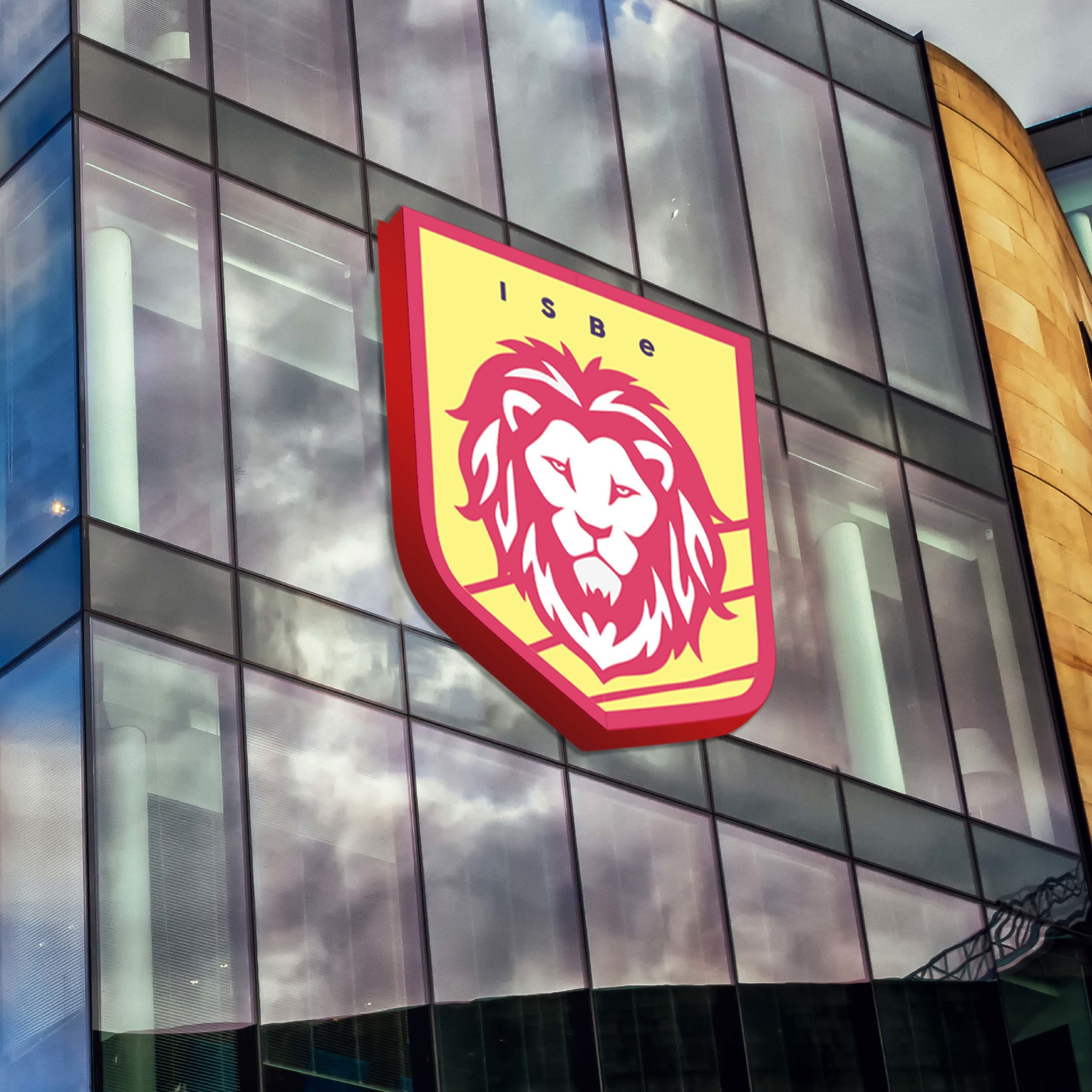
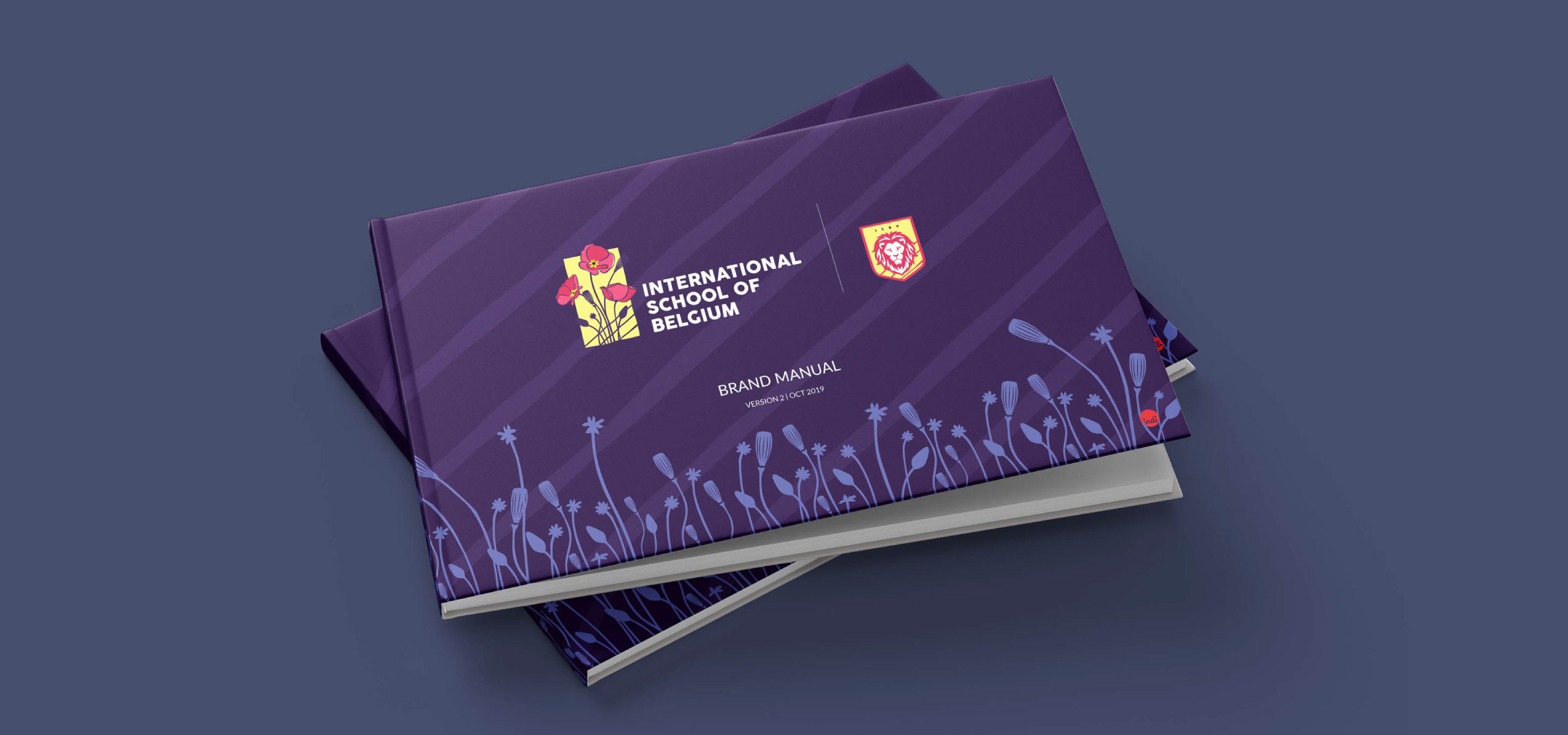
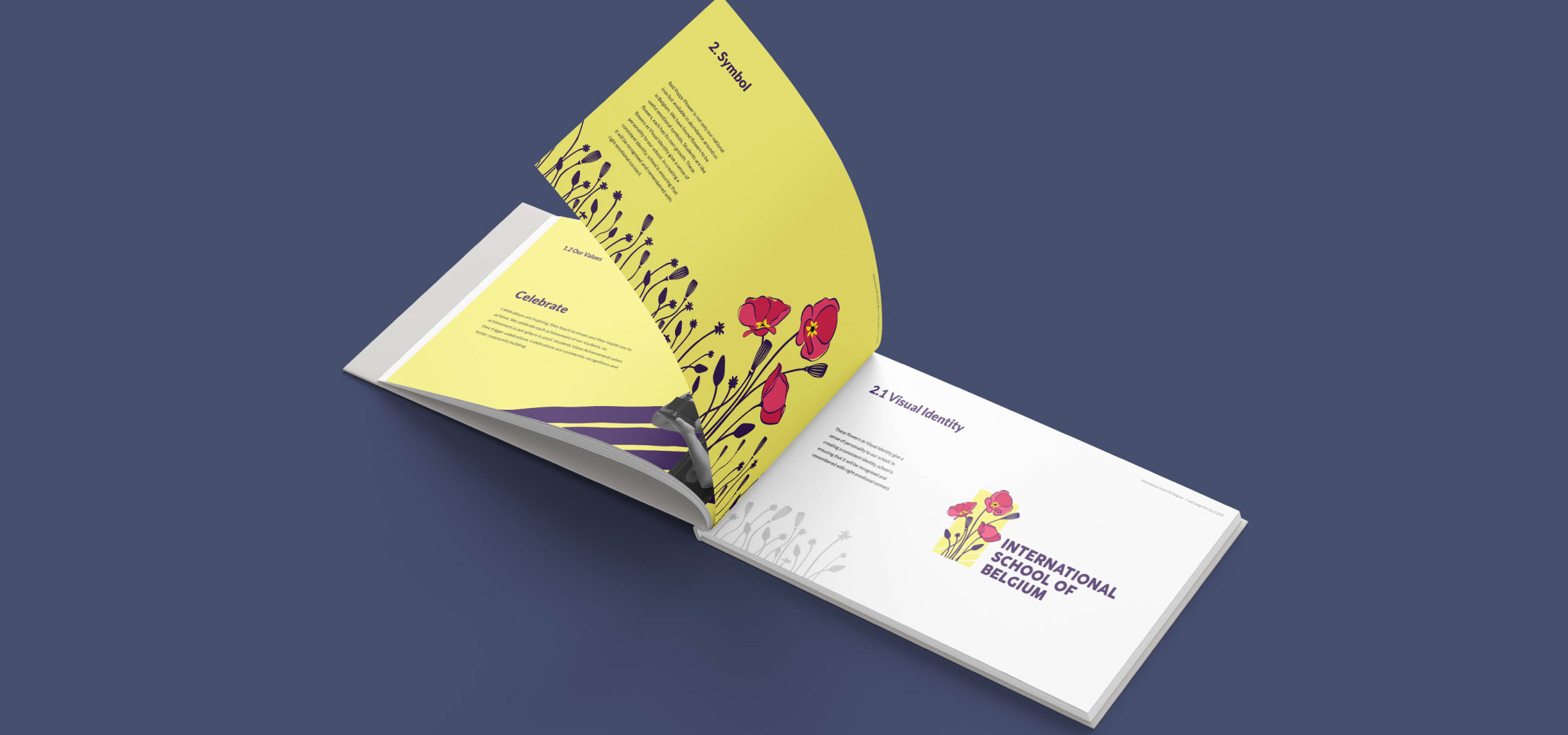
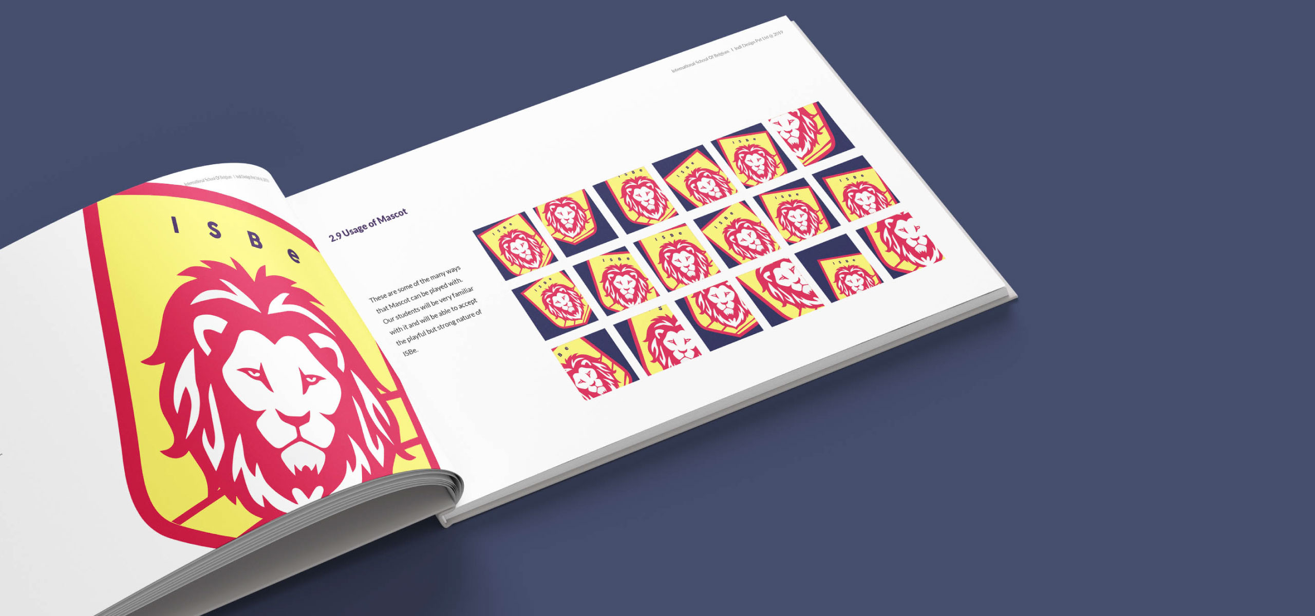
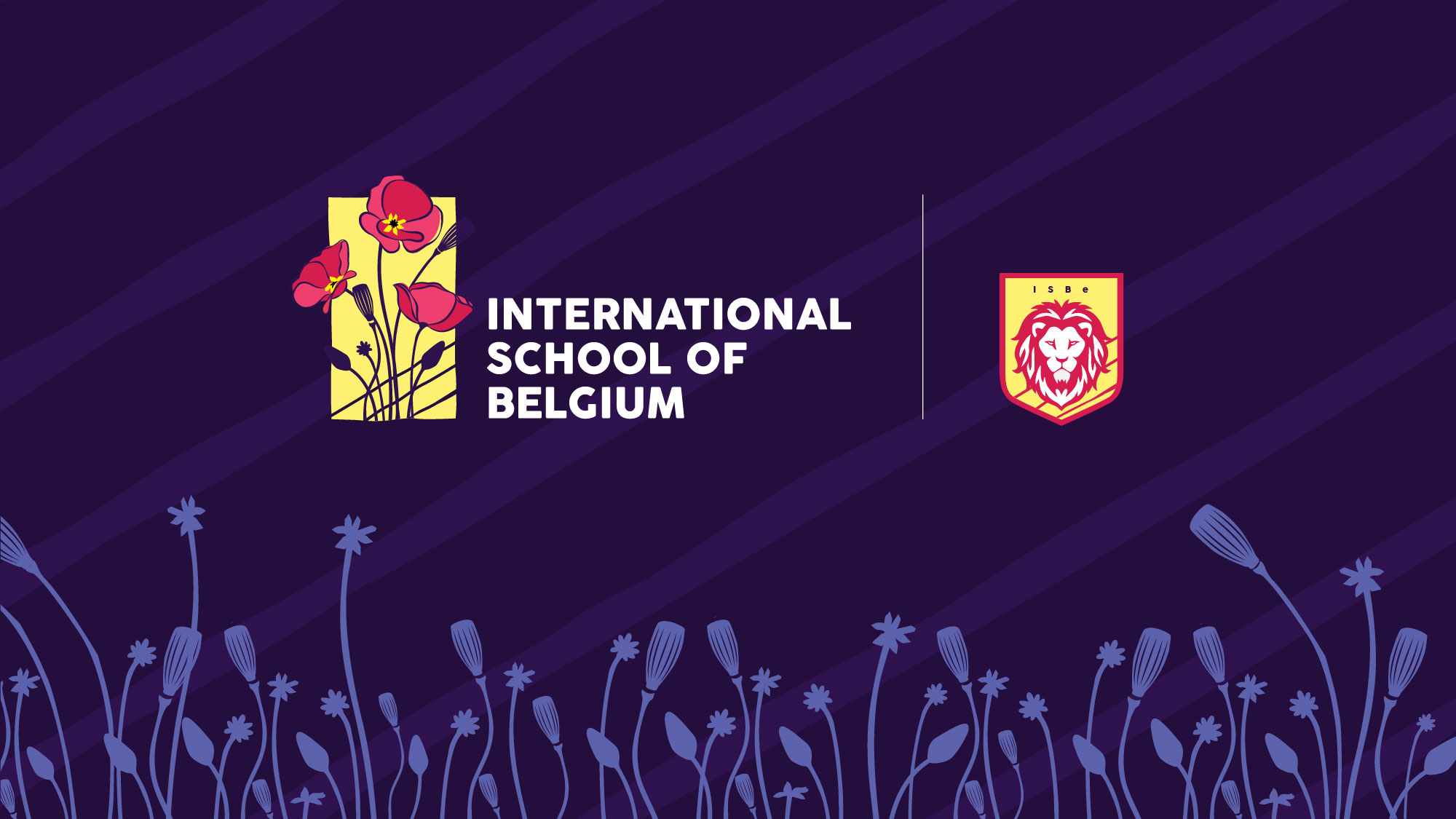
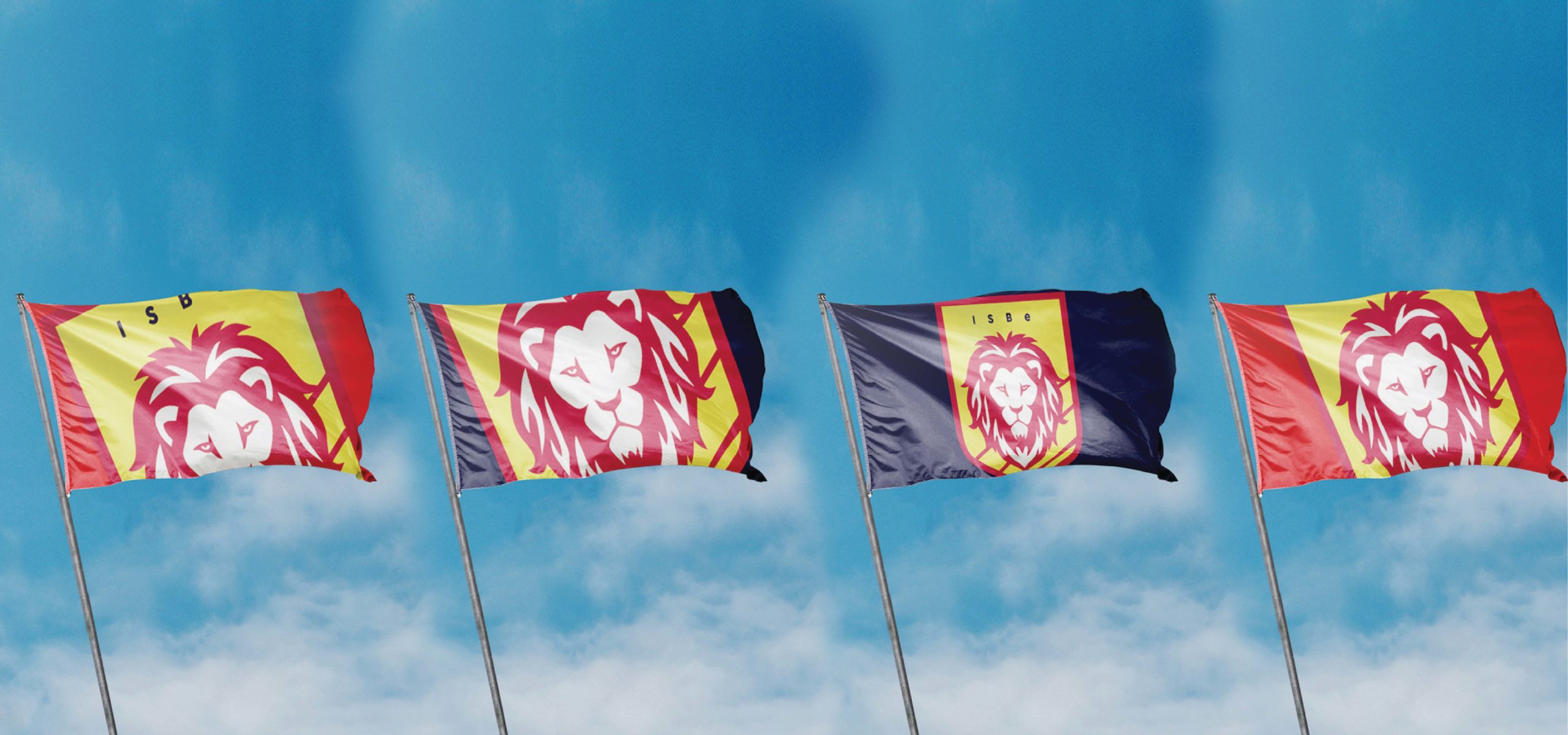
To serve as the school’s brand identity, IndiDesign selected the red poppy flower, which is the national icon of Belgium and available in abundance in the area. The red poppy is a relatable emotional symbol representing each student’s unique qualities and growth potential. The lion mascot, ISBe, exudes constructive energy and personifies the spirit and enthusiasm of the student body.
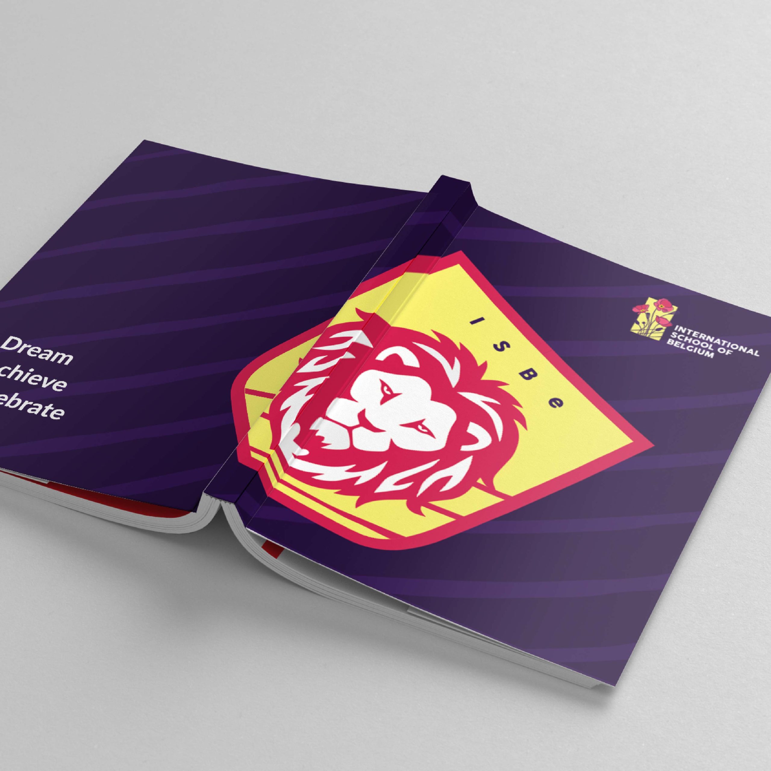
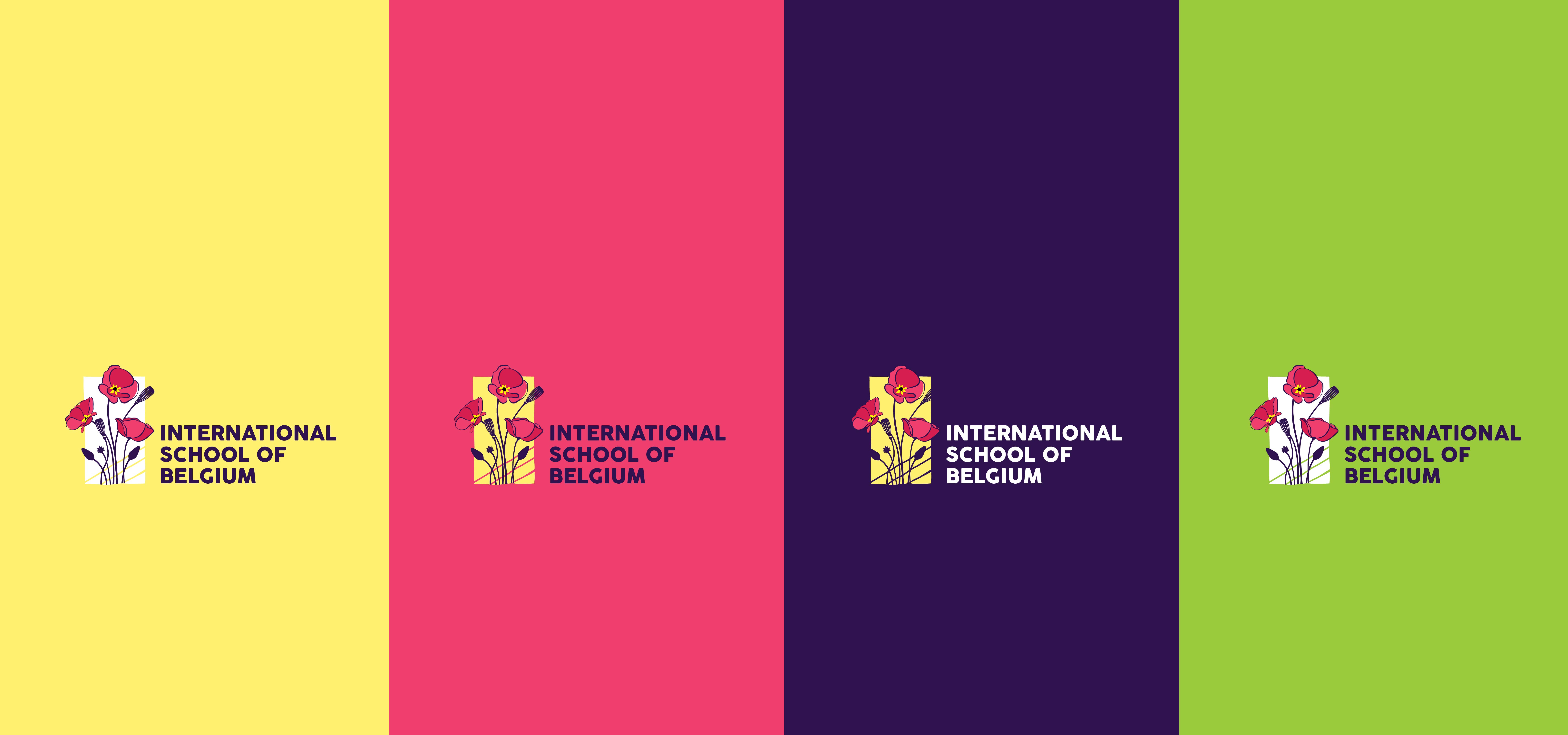
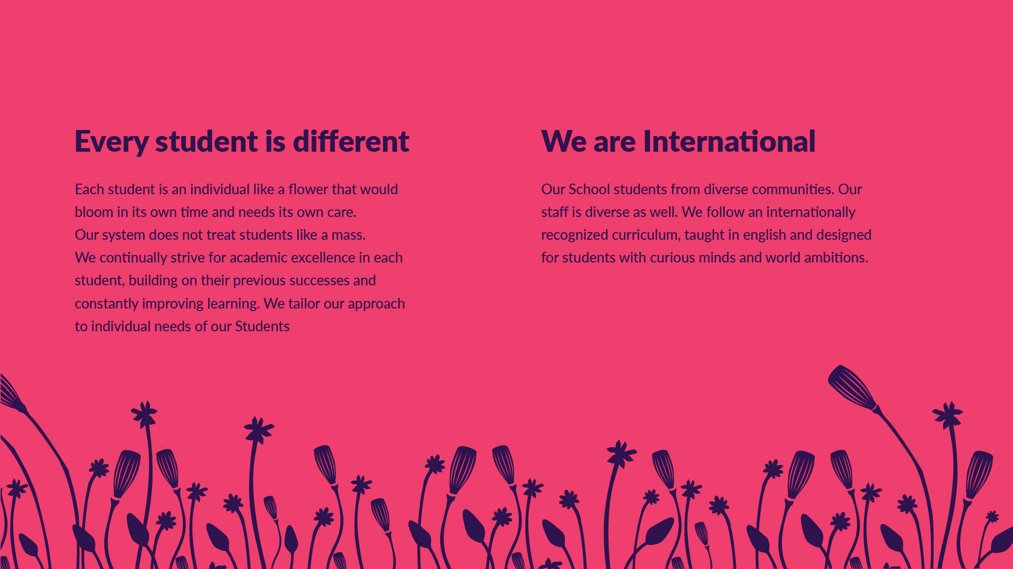
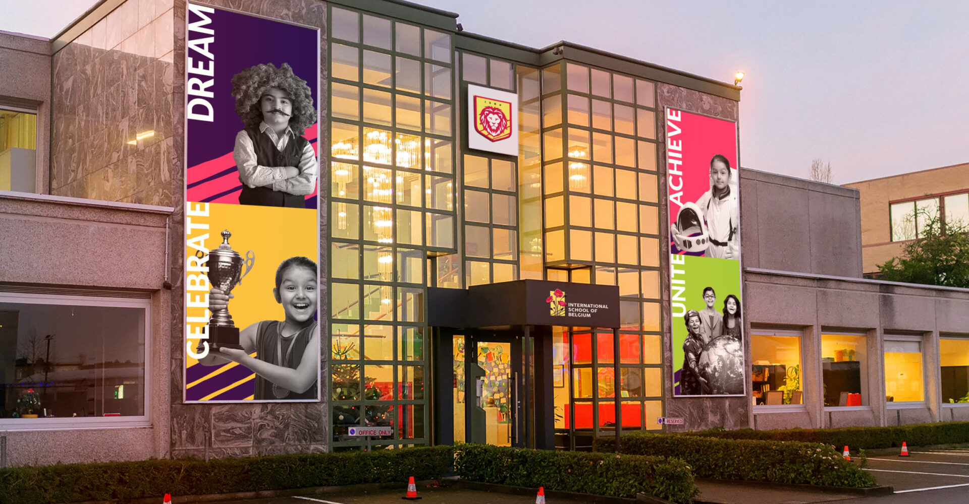
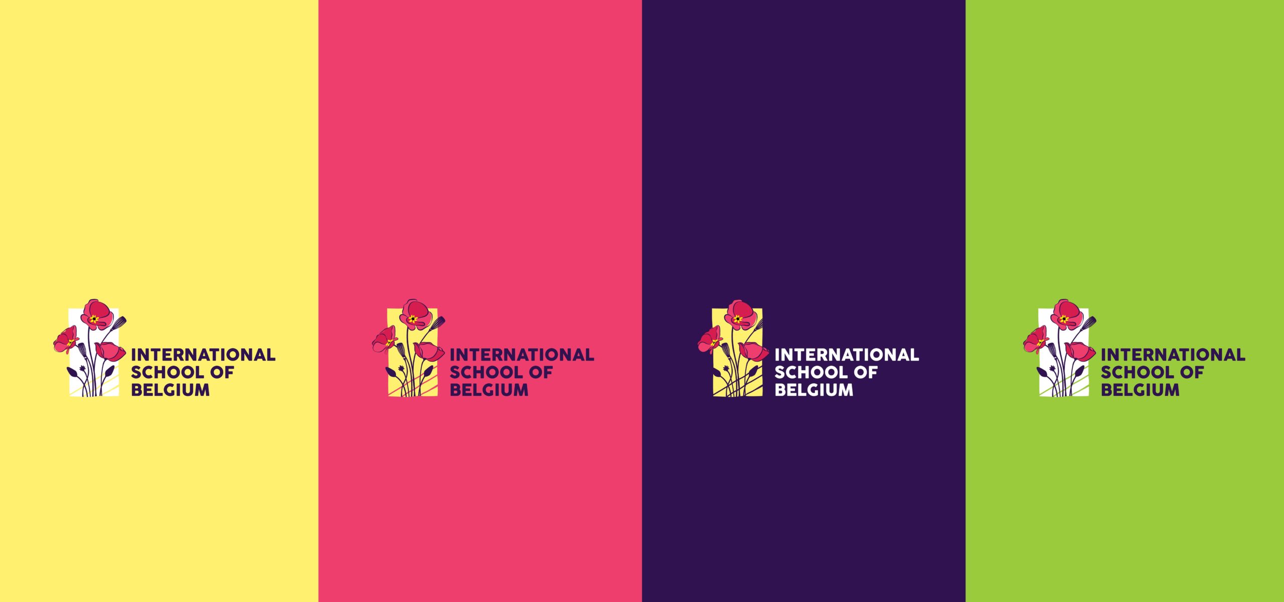
IndiDesign has created a flexible but dynamic visual identity system that reflects the institution’s modern approach to education. The staff and students take immense pride in identifying with the school’s new, energised persona.






International School of Belgium
Industry: Educational Institute
Brand Identity & Communication Design

International School of Belgium
Industry: Educational Institute
Brand Identity & Communication Design
International School of Belgium
Industry: Educational Institute
Brand Identity & Communication Design


International School of Belgium
Industry: Educational Institute
Brand Identity & Communication Design
International School of Belgium
Industry: Educational Institute
Brand Identity & Communication Design
IndiDesign built the complete brand identity, including naming, branding, visual identity, and communication design for International School of Belgium, a modern tech-savvy school with 21st-century learning strategies located in Kontichsesteenweg, Belgium.

The school, which had previously gone by a different name, needed help connecting with local and international students. It required a new name and visual identity system to bridge the gap.
IndiDesign proposed a new name and updated visual identity centred around the school’s core values of creativity, curiosity, open-mindedness, and individual reflection. The rejuvenated identity helped the school to connect better with students.
To serve as the school’s brand identity, IndiDesign selected the red poppy flower, which is the national icon of Belgium and available in abundance in the area. The red poppy is a relatable emotional symbol representing each student’s unique qualities and growth potential. The lion mascot, ISBe, exudes constructive energy and personifies the spirit and enthusiasm of the student body.
IndiDesign has created a flexible but dynamic visual identity system that reflects the institution’s modern approach to education. The staff and students take immense pride in identifying with the school’s new, energised persona.


International School of Belgium
Industry: Educational Institute
Brand Identity & Communication Design

International School of Belgium
Industry: Educational Institute
Brand Identity & Communication Design
International School of Belgium
Industry: Educational Institute
Brand Identity & Communication Design


